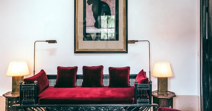
Red, as a color, is not the first thing we think of when we think about rest and relaxation. In our culture, it is a symbol of strong emotions, passion, and enthusiasm. In many cases, it’s a symbol of energy and anger. Yet, with a balanced and subtle approach, red can be implemented in interior design through accents, some smart spacing, and tones. In most design ideas with this intent, red can be tamed by a paired color such as grey or white, creating a harmonious combination.
Key Takeaways:
- Red isn’t thought to be calming but done in the right way, it can have a calming effect.
- Don’t go with a solid red color in any room, you will want to have a bit of red here and there instead.
- The white table in the photos, quench the fire started by the red chairs in the photo.
“However, these three home designs display a skillfully balanced approach to the red accent through intelligent spacing and use of tone. We’ll look at red decor that’s cooled by pale grey expanses and white intervals before we tour an apartment that’s colored only by its furniture.”
Read more: http://www.home-designing.com/red-and-restful-home-interiors
Leave a Reply